Welcome to the eighth and final article in our user experience series. In our previous post, we discussed the importance of accessibility when designing and building products usable by everyone.
In this post, we will learn about the importance of understanding the psychology of users when designing our products along with some interesting and common principles.
In case you missed them, you can find the other articles in our user experience series below:
- http://iq-inc.com/why-ux-is-important
- http://iq-inc.com/how-to-conduct-user-research
- http://iq-inc.com/writing-meaningful-user-stories
- http://iq-inc.com/typography-in-ui-ux-design
- http://iq-inc.com/ideation-and-interactive-prototypes
- http://iq-inc.com/usability-testing
- http://iq-inc.com/accessibility-and-universal-design
While the intricacies of social, behavioral, and cognitive psychology cannot be adequately covered in our time together, we hope that this topic will get readers interested in learning more and applying the principles covered here to real-world applications.
Psychology is an integral part of UX design. Because we are designing products and services for people, understanding the people part of the equation is critical for achieving desired outcomes and for providing the best experience to users. Understanding people’s psychological needs includes needs for security and safety, motivations and rewards, and accomplishment. It may also include how the brain and eye perceives visual information and ways to take advantage of memory limitations.
Below are some of the core psychological concepts to know in a product design. Many of these principles feel like common sense and yet there are many cases in which they are not considered nor applied.
Gestalt Theory
Gestalt psychology can be characterized by the statement that “whole is greater than the sum of its parts.” Our minds are naturally wired to try to find patterns and make order out of chaos. Gestalt theory is guided by the following six principles.
1. Proximity – When objects are close to each other, they are perceived to be a group and hence, related. This is applicable in forms, input labels, text and images, or a series of buttons. Items that are related conceptually should be closer together and items that are not should be farther apart.
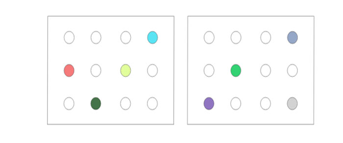
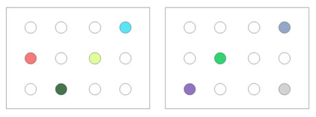
2. Similarity – When objects are visually similar to each other in color, size, shape, or iconography, they are perceived to be related or grouped together. Use the law of similarity if you need to maintain a unified identity of items if proximity is not an option.
3. Common Region – When objects share an area with a clearly defined boundary, they are perceived to be related or grouped together. In practice, if there are different groups of items that are important to be perceived together, using borders or cards can visually separate that grouping from others around it.
4. Figure/Ground – Items are either the figure (elements that the main focus) or the ground (the background where the figures sit). This plays on people’s ability to visually separate different “layers” or “planes” of items. Employ this technique when highlighting a certain focus area by using techniques like contrast and information hierarchy. Avoid confusing users by having ambiguous focus areas on the screen.

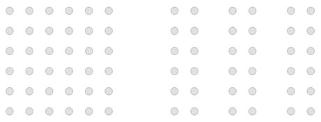
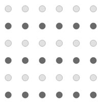
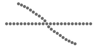
5. Continuity – The law of continuity refers to the human eye’s ability to follow alignment from one object to another. Even if there is an intersection of objects, the eye sees it as continuation rather than discrete elements. In the example below, it is clearly a series of circles with no inherent meaning to it whatsoever. However, our eye perceives the straight line as distinct from the curved line despite the overlap.
6. Closure – The law of closure refers to the human eye’s ability to fill in the gaps and perceive elements as being whole even when they are not complete. As an example, have you ever seen a list (either horizontally or vertically) in which part of an item is visible and the rest is off the screen? By doing this, designers are able to make the user feel as if the list contains more elements and incline the user to scroll to see more.

Von Restorff Effect
This effect is also known as the “isolation effect.” It states that when there are multiple similar items present, the one that differs from the rest is most likely to be remembered. The principle here is to make important information or key actions visually distinctive. This helps improve memory and prompts action.
Chunking
Psychologists like to think about memory in terms of chunks. A chunk is an organizational unit of memory. In human memorization, we tend to memorize in terms of chunks by breaking up content into smaller units of information. Consider a 10-digit phone number. It is easier to process and memorize a chunked number (123) 456-789 than an unchunked series of digits 123456789. This principle can also be applied to text such as encouraging shorter paragraphs, line widths, and whitespace which can help improve comprehension.
Recognition vs. Recall
Recognition refers to seeing and recognizing a particular term. Recall refers to recalling a particular term from memory. Consider a question like “What is the capital of Pennsylvania?” In this case, a user has to recall the capital from scratch without any external cues. However, a question like “Is Harrisburg the capital of Pennsylvania?” allows the user to simply recognize whether the information is correct.
In an application, a common search bar can be daunting for many people because it requires the use of recall in order to know what keywords to search for. However, if the search bar doubled as a dropdown menu with some common search terms, it allows the user to merely recognize the keywords he or she may be looking for.

Hick’s Law
Hick’s Law states that the time it takes to make a decision increases with the number and complexity of choices. If a patron enters a restaurant with a menu of 100 items, making a decision is going to take a lot longer than a menu with only 10 items. Similarly, when designing interfaces, simplify the choices for users, break down complex decisions into smaller steps, and avoid overwhelming users by removing unnecessary items from the screen.
Serial Position Effect
This effect is the combination of two other effects, namely the primacy and recency effects. It states that when given a sequence of items, users tend to remember the first and last items the best. When applying this principle, place important information in the beginning (or end) of a list or perhaps important actions in the far left or far right of a list rather than in the middle. On the flip side, put the least important items in the middle of a sequence.
Conclusion
People are complex and a deeper understanding of the human part of the equation allows us to design and develop better products that meet the user’s needs. Knowing principles regarding memory constraints and how the eye and brain perceives information is invaluable to a UX designer. As we have only scratched the surface in applying psychology research to design decisions, we encourage all to continue the recommended follow-up reading below.
For more information, please visit:
- https://www.nngroup.com/topic/psychology-and-ux
- https://www.interaction-design.org/literature/topics/gestalt-principles
- https://www.nngroup.com/articles/chunking
- https://www.nngroup.com/articles/recognition-and-recall
- https://lawsofux.com
(Images in this posting are able to be used and shared commercially via “google advanced search”.)