Up to this point in our UI/UX blog series, we’ve discussed Why UX Is Important, How To Conduct User Research, and Writing Meaningful User Stories. This week we are going to take a slight diversion. We’ll be talking about typography and its importance to the user experience. Good type design promotes clarity, readability, and accessibility.
Clarity:
A great way to improve clarity is the use of hierarchy (headings, subheadings, body, caption, etc.) for your type. A great rule of thumb is to halve your header size, for the body type size. So if your header is 30px, make your body 15px.
Header
The quick brown fox jumps over the lazy dog.
Readability:
In order for your text to be readable, you should let it breathe. In other words, white space is your friend. A lack of white space can make the text illegible. If the words are too close together, they are likely to be difficult to distinguish. On the other hand, if there is too much white space, the reader has a higher chance of getting lost.
Thequickbrownfoxjumpsoverthelazydog.
The quick brown fox jumps over
the lazy dog.
Further Readability Considerations:
Line Length – A shorter line is easier to read, and should be between 60 to 80 characters.
Font Choice – Multiple typefaces within a single design can be overwhelming. A safe bet is to use typefaces from the same family. Where possible, use the system fonts. In Android the system font is Roboto. In iOS it is San Francisco, and the system font for Windows is Segoe UI.
Accessibility:
All of the above ideas lead to content that is more easily accessible. Another important consideration to take into account is color and contrast.
When displaying body text on a screen, it is better to use dark gray rather than black. With screens having more contrast than paper, it can become tiresome to read.
The quick brown fox jumps over the lazy dog.
The quick brown fox jumps over the lazy dog.
According to rxoptical.com:
White text on a black background, or “dark mode,” makes the eye work harder and open
wider, since it needs to absorb more light. When this happens, the white letters can
bleed into the black background and cause the text to blur, which is also known as the
“halation” effect.
For more information on typography in UI/UX design, please visit:
https://blog.prototypr.io/8-rules-for-perfect-typography-in-ui-21b37f6f23ce
https://uxdesign.cc/7-typography-tips-for-interface-design-b7185e9397c4
Title: Typography in UI/UX Design
Author: Scott Plummer
Photo Cred:
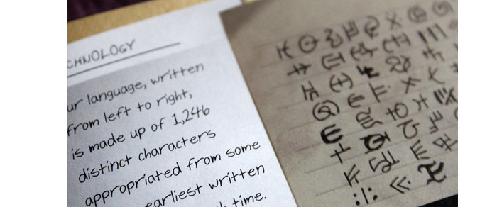
“Macro Mondays – September 16th: Typography” by penelope_134 is licensed under CC BY-SA 2.0